
I’m well aware that for us to succeed long term as a Benefit Restaurant®, we must be transparent in terms of how and where we direct our philanthropy. All our stakeholders must be able to trust us. To that end, transparency in this case boils down to sharing the raw data and statistics on how we determine how much we give, when we give it, and of course, to whom.
I’m an admirer of well-crafted infographics, because sometimes pictures ARE worth a thousand words. The Scoreboard page at benefitrestaurants.org is one such page that’s been sterile since I built it. I’ve started working on changing that.
This morning I came across the website infogr.am which is a free online tool for creating pretty cool infographics! And so I created one that would show how our giving has been proportioned by year since 2009 when we first became a Benefit Restaurant®.
The trouble is, this website is hosted on WordPress.com. They are fairly strict about what it will NOT allow in terms of computer code to be embedded into a WordPress.com webpage. So… I poked around for another path to my goal of sharing our data graphically.
It’s far less sexy than dynamic infographics, but I’ve decided to go with sharing charts I create in Google Spreadsheets – as a business we’ve use Google Apps for our email and document sharing for years now – as images, which WordPress.com is fine with embedding in webpages. And the most important thing is that the information gets to the people!
So… here you are, our first infographics: How, as a Benefit Restaurant®, our giving has been proportioned by year:
We became a Benefit Restaurant® in September 2009, so the first graphic above is about as bare bones as they get. Once we were really rolling in 2010, we learned some quick lessons about what was really engaging our guests and nonprofit beneficiaries. Those lessons drove us to, later that year, redirect a portion of our giving. Early on we transitioned from we ourselves selecting Crisis Beneficiaries to instead giving our guests the opportunity to host Monday Benefit Dinners at the restaurant for causes THEY championed. In 2011, that transition was complete. We also still do a couple of special events a year that result in cash donations, but our focus is now sharply on our Monthly and Monday Benefit Dinner Beneficiaries.
More infographics to come in the near future! – And, if you have any requests or suggestions, please email me: bob at elephantwalk dot com.
Tagged: charity, philanthropy, waltham

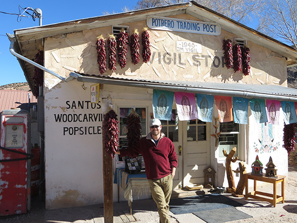
 As it turns out, before being renamed “El Potrero Trading Post” in 1975, the store began its life as “Vigil Store” in 1921, serving visitors to the adjacent shrine. Today it sells mostly products made by local artists, including the gentleman serving us,
 In closing I want to point out that, as in these pictures, I have been proudly wearing my Pine Street Inn baseball cap for much of this trip in honor of the fact that our February beneficiary is Pine Street Inn: We will be giving 3% of our February sales to Pine Street in – for the 4th consecutive year!